Isn't it cute. I may do a little tweaking yet but I'm pretty pleased with how it turned out.


 This is made using the Blissful Bride stamp set. I added a little bit of the Bride specialty paper to the skirt for some glitz. I used Bashful Blue card stock and So Saffron ribbon (DD#1's wedding colors)
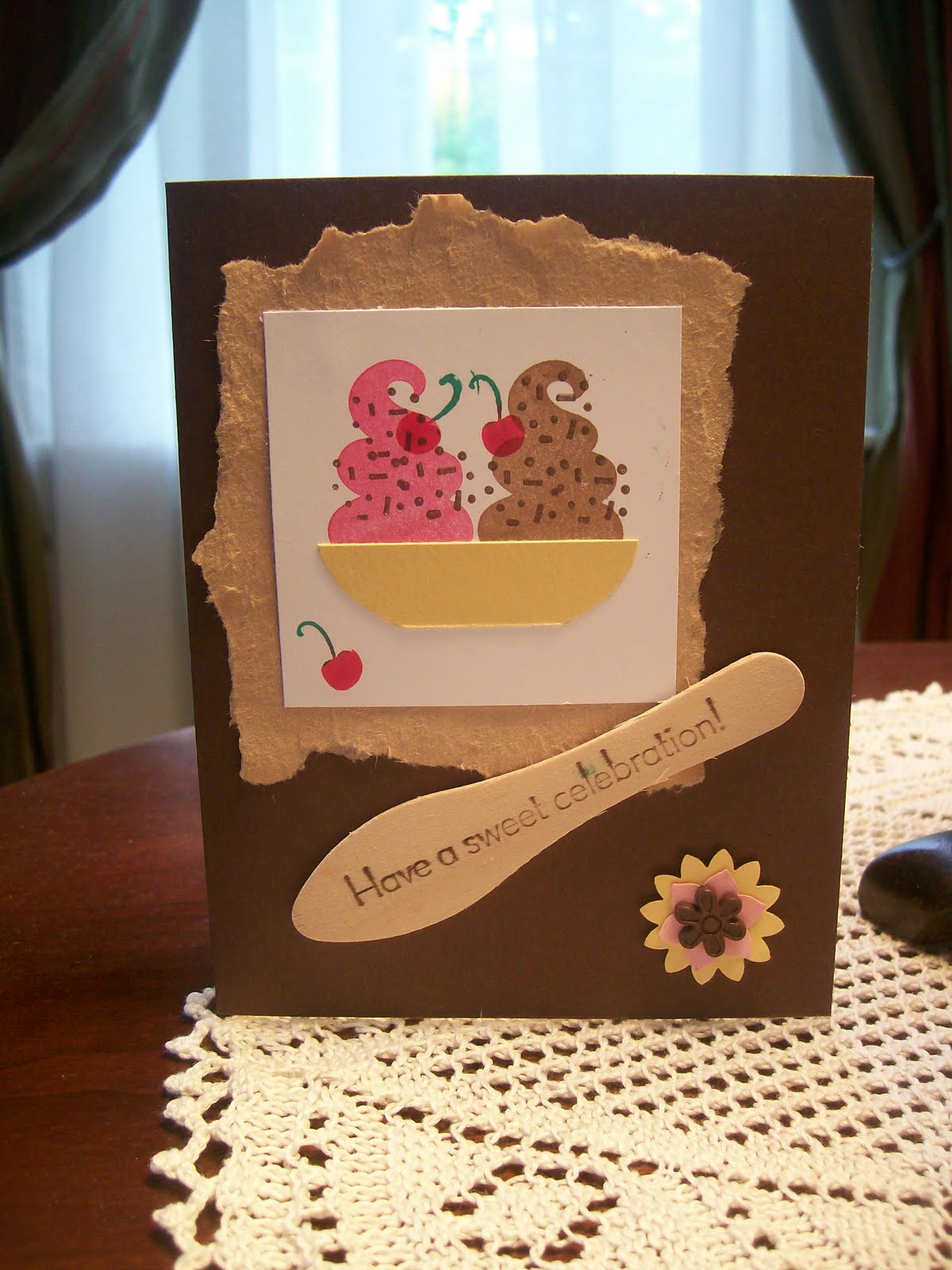
This is another card made with Blissful Bride. This time I used Ballet Blue and So Saffron. A really fun set is the Sweet Scoops. With this one I used Melon Mambo, Chocolate Chip and Gable Green inks. I added the Look Who's Turning 'Happy Birthday' The card stock is Close to Cocoa and Gable Green.
 For the ice cream I used the kissing technique. The ice cream color are Gable Green kissed with Close to Cocoa, Crushed Curry kissed with Pumpkin Pie and Pixie Pink kissed with Melon Mambo.
 I used Tempting Turquoise paper run through the Big Shotz texture template and sponged it with Close to Cocoa for the background. The bowl is the wide oval punched along the straight edge of a piece of Crushed Curry card stock. The sentiment is from the Teeny Tiny Words set.
 This uses Melon Mambo and Chocolate Chip inks. The ribbon was attached using a new technique I learned at the conference in Milwaukee. I will have to post directions for that some day :-)

This is my favorite - I made the banner from Pixie Pink and curved it over the end of the piercing tool.
 A cute idea I saw on the demonstrator website. I used Rich Razzleberry and Pumpkin Pie for the ice cream scoops.
 And something I just had to try :-) The ice cream scoops are Pumpkin Pie, Melon Mambo and So Saffron.


 I saw some cards online that gave me the ideas for this one. The corner punch and the little bit of foiled Bride paper were from those cards. I used the heart corner border punch and word window punch. Ballet Blue ink, Bashful Blue card stock, So Saffron brad and ribbon. DD#2 chose this one to use for her gift for her sister.
 This shows some of the other images in the stamp set. I used Ballet Blue and So Saffron card stock, Bashful Blue, Basic Brown and So Saffron ink pads, blender pens and the piercing tool and mat. I don't have the little tool for fraying the edges but I just ran my thumbnail along the edges to give then a little 'fraying'. Both of these are odd sized cards so they will just be placed in the gift bags as they are.
 This uses two pieces of DSP I used the Modern Label to punch the tabs for the ribbon ties. The stamp is from the Thoughts and Prayers set.
 I have seen this pinwheel on lots of demo cards. I changed it up a little extending the base enough to add a ribbon tie. This is a nice generic card which I think I will use for a birthday tomorrow.
 The DSP on this one looks like marble. I had to practice with the scallop edge punch - I have trouble getting it lined up but am proud to say I did not mess up at all on this one :-)
 The DSP had a huge floral design on one sheet that I had to try to preserve.
 Another one with the large floral design.
 And the last one for tonight. I didn't put a sentiment on this one but figured there is plenty of room to do so on the front when I send it (whatever I use it for).
 I also needed a juvenile birthday card - so thought I would try some of the other retiring colors - Brilliant Blue, Glorious Green and Really Rust. I thought they worked well together. The stamp set is Look Who's Turning.
 This was the first card - an easel card for Easter. The card stock is Shadow Sage, Apricot Appeal, Bashful Blue and Very Vanilla. The stamp set is Abundant Hope. We used the 1 3/8 inch circle, Modern Label and Ticket Corner punches. Watercolor pencils and a blender pen were used to color the flowers. This uses a technique called Spotlighting - the ladies loved it!
 The second card was a masculine 'flip' card. This was a real challenge- the Elegant Eggplant paper was hard to work with for all the scoring and cutting since the black numbers and marks on the cutting guide did not show up very well in the lighting where we were working. But the ladies worked hard on it and they all made it through. The card stock used on this one is Elegant Eggplant, More Mustard and Soft Suede. We used Elegant Eggplant ink and rick rack. The brads are some I had on hand from before SU days - but you could easily use some of the Vintage Brads on this one. Punches are the Designer Label, Wide Oval and Small Oval.
 And our last one was much easier but still something other than the traditional card style. This is called a gate card. The paper is Tempting Turquoise, Summer Sun, Pixie Pink and Kaleidoscope designer paper. The stamp set is Three Little Words (one of my favorite and you can get it free during Sale-a-bration - ends March 31). We used Tempting Turquoise ink.
